The Map Room blogs about San Francisco's new public transport maps that will employ more "straight lines", also covered more in depth here. I find these sort of map abstractions really interesting, so I thought I would chip in with a couple of similar "straight-lines" public transport maps from Copenhagen. It must take a good degree of ingenuity to weigh accuracy with simplicity.
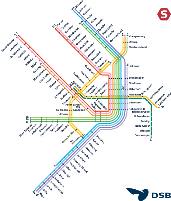
The first one shows the most used map for the network using straight lines as much as possible. You can still clearly see the "five-finger plan" that had been used for city planning for many years by expanding out in "fingers" and allow for greener less dense areas in between. Click the image for a larger view:
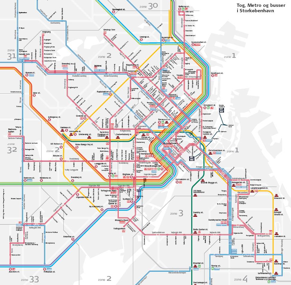
The second shows a much more dense map (usually used on a larger poster) which also shows some of the major bus routes. This map is much more geographically correct with a slight grey outline of the land behind it. It still uses straight lines to simplify the map (click for larger view):
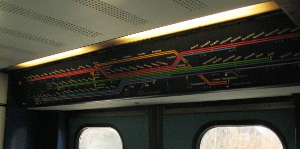
There's an even simpler version, where the map is far from geographically correct, but instead shows the network and connections as a set of mostly horizontal lines. This map is mostly used inside the train, so at this point you (hopefully) already know where you are headed and don't need any geographic resemblence. Therefore this "map" only shows which stations the train lines stops at/skips and where they connect to each other,and it fits nicely over the door :-) (unfortunately this was the best picture I could find):